
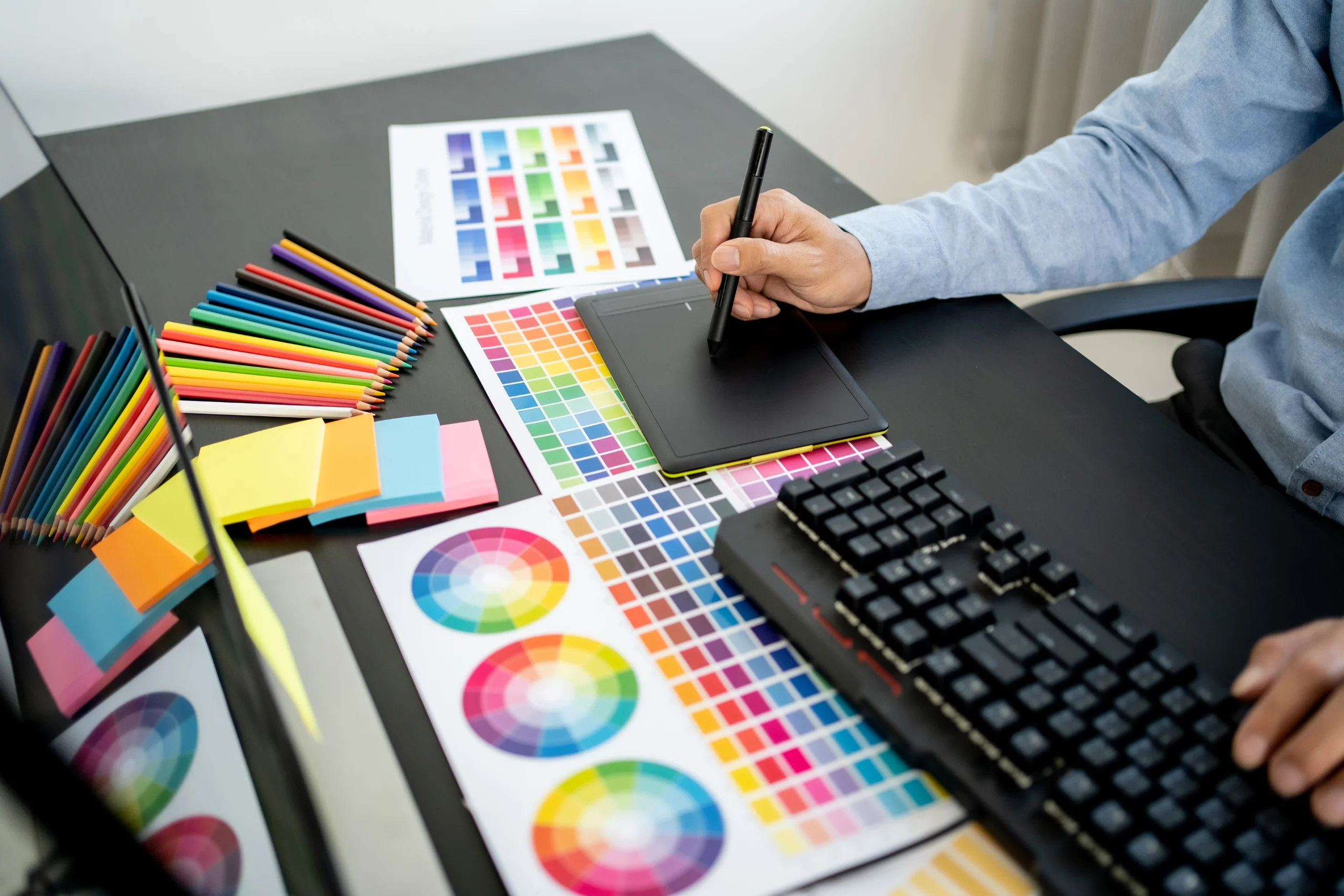
If you know anything about branding, then you know how important visuals are in building a powerful brand. Whether you’re creating marketing collateral, tweaking your website design, or designing a brand new logo, you need to know the fundamentals of graphics design to get the desired results. In case you don’t know the same, you needn’t fret. We’ve shared the 5 most important graphics design tips for budding entrepreneurs below.
Table of Contents
1. Use Repetition for Improving Brand Recall Factor
What’s repetition in graphics design? It is when you reuse the same graphics element in your design over and over again. When you do this, it makes it easier for the viewer to connect the elements without you directly telling them to do it.
There are many ways to implement the repetition technique in graphic design. For instance, you can use the same brand colors palette, fonts, icons across your website, product design, videos, social media, etc. Over time, this can help establish a unique identity of your brand in the industry. Take a look at the image below. You can’t see mention of any brand in the visuals. Yet, you can easily recall the brand “Target”. Why? Because the company has done such a good job of maintaining brand consistency, that you can instantly associate the white and red concentric circles with the logo, and hence the brand.
2. Highlight Core Messaging With Contrast and Hierarchy
Hierarchy plays an important role in graphics design as it serves to provide visual organization. You can achieve hierarchy either by using different sizes of design elements (small and big fonts, for instance), or by using different placements (higher the physical placement of a design element, higher its rank).
Visual hierarchy assists a reader/viewer in understanding which are the most important parts of a document/page. For instance, you can observe how in blog posts typically, the headings have the biggest font size. The subheadings generally have smaller font size, and the paragraphs under these subheadings have the smallest font size.
Contrast is another important graphics design concept. It allows you to highlight the differences between multiple elements on a page. Additionally, it helps you to become WCAG-compliant, enabling those with vision impairments to access and consume your content.
It’s best to use a specialized digital brand guidelines platform like Lingo where you create, share, and update your digital style guide to ensure you’re following the correct contrast and hierarchy. However, if that’s not possible, be sure to at least maintain a brand book where you save all these details of design parameters that have to be followed across all your digital and physical assets.
3. Leverage Color Psychology
Did you know that different colors are associated with different characteristics and evoke different emotions in us? For instance, red is associated with energy and enthusiasm which is why you see many energy drinks incorporating this color in their logo and packaging. Similarly, black color is associated with prestige and power, making it a top choice for brands seeking to establish their products as suited for the “bold”.
By choosing the appropriate colors that go with your brand messaging and identity, you can influence your target audience and sub-consciously connect with them through your products. This is one of the most powerful ways to build a memorable brand.

4. Maintain Perfect “Balance”
Every graphics element has its own visual weight which comes from a combination of text, visual size, color, and contrast. This “balance” can be any of these four types- symmetrical, asymmetrical, mosaic, and radial. Each type has its significance in graphics design. For instance, symmetrical balance shows perfection, while asymmetrical balance reflects creativity and the aspect of drawing attention.
Understanding these different types of balances allows you to pick the suitable option for your brand. That said, no matter which option you pick, make sure that the copy you put on your website, app, etc. is clear and readable, there is enough space between different design elements, words, characters, etc. These are just fundamental design principles that have to be followed in any situation.
5. Keep it Simple
Entrepreneurs are generally highly passionate and ambitious individuals. They are deeply attached to their business, their brand. That’s why, when it comes to creating a website, logo, etc. for their brands, they may feel inclined to use complex and elaborate designs to showcase their “grand” brand. Contrary to popular belief, simple and sharp graphic designs tend to perform much better than overly detailed and in-depth designs.
Think of some of the most popular brands, the likes of Nike, Apple, and Audi. These brands have simple logos, simple visuals on their websites, and are clear on what they’re selling and what their overall messaging is. They don’t bombard their website or app visitors with complex color palettes, interactive elements, and imagery. They keep it simple, which is why they are so powerful. Once you understand the power of simplicity, you can easily create highly effective graphic designs for your business.

Conclusion
Graphic design is a powerful aspect of building a memorable brand. It allows you to reach out to your target audience, captivate it, and turn potential buyers into long-term clientele. It also plays a pivotal role in building your reputation in the market. Thus, it’s really important to do it right. The tips and techniques we’ve shared above can help you in creating unique and impactful designs that can bring your vision to life.