
Key Takeaways
- Your clothing brand’s custom logo is your brand’s most visible identity marker.
- Design should be simple, versatile, and aligned with your brand’s personality.
- Color and typography choices communicate emotion and style.
- Always consider your target audience when making design decisions.
- Test your custom logo before finalizing, and prepare it for multiple applications.

In the clothing industry, your logo has to work just as hard as the garments and accessories you sell. Think of it as the “face” of your brand — the first thing a customer sees, the image they remember, and the symbol they associate with your products. Just as a beautifully tailored jacket can make someone feel confident and stylish, a well-crafted logo can instantly communicate your brand’s personality, values, and quality.
A logo in the garment sector must be as attractive, well-fitted, and high-quality as the pieces you offer. At a glance, it should express your sense of style and aesthetic taste. That means it’s more than a decorative mark — it’s a strategic branding tool that sets you apart in a crowded marketplace.
We all know the iconic logos in fashion: the minimalist swoosh of Nike, the interlocking C’s of Chanel, the bold block letters of Supreme. These designs are etched into our minds because they’re distinctive, consistent, and aligned with the brands’ identities. Yet, many clothing startups still overlook the true importance of their logo — rushing the process or treating it as an afterthought.
If you want to design your own clothing brand logo — and do it well — you’ll need to understand not only the creative side of design but also the business strategy behind it. Learn about the basics of an effective logo design.
Table of Contents
Why Logos Matter in the Clothing Industry
In fashion, your visual identity is often your first — and sometimes only — chance to make a lasting impression. Long before someone feels the fabric or tries on a piece, they’ve already formed an opinion about your brand based on how it looks. That first impression usually starts with your logo. Whether it’s displayed on a boutique sign, printed on a hang tag, or featured in the corner of an Instagram post, your logo quietly shapes the way people think about your products.
A strong clothing brand logo does more than look polished. It works behind the scenes to influence how customers perceive your quality, style, and credibility.
Here’s why it matters:
- Communicates Style Instantly
Your logo tells people, in seconds, what your brand stands for. A sleek, minimal wordmark might suggest refined luxury, while bold, stencil-style typography could point to streetwear with an edge. Just like an outfit can convey personality without a word, your logo communicates your fashion identity before a customer even clicks “Add to Cart.” - Builds Recognition Over Time
Fashion is competitive, and brand loyalty takes repetition. The more often customers see your logo — on tags, packaging, social media, and store signage — the more they remember and trust it. Over time, your logo becomes a mental shortcut for your values and quality, making it easier for shoppers to choose you over competitors. - Adds Perceived Value
In clothing, presentation can be as persuasive as the product itself. A well-executed logo can subtly suggest higher quality and exclusivity, allowing you to command better price points. Customers often assume that if the branding looks refined, the clothing must be equally well made. - Acts as a Brand Signature
Your logo becomes your signature mark, appearing everywhere — stitched into shirt collars, embossed on leather goods, printed on labels, and featured on your website. Over time, it becomes synonymous with your work, much like the Nike swoosh or the Ralph Lauren polo player.
Case Study: Everlane’s “E” of Trust
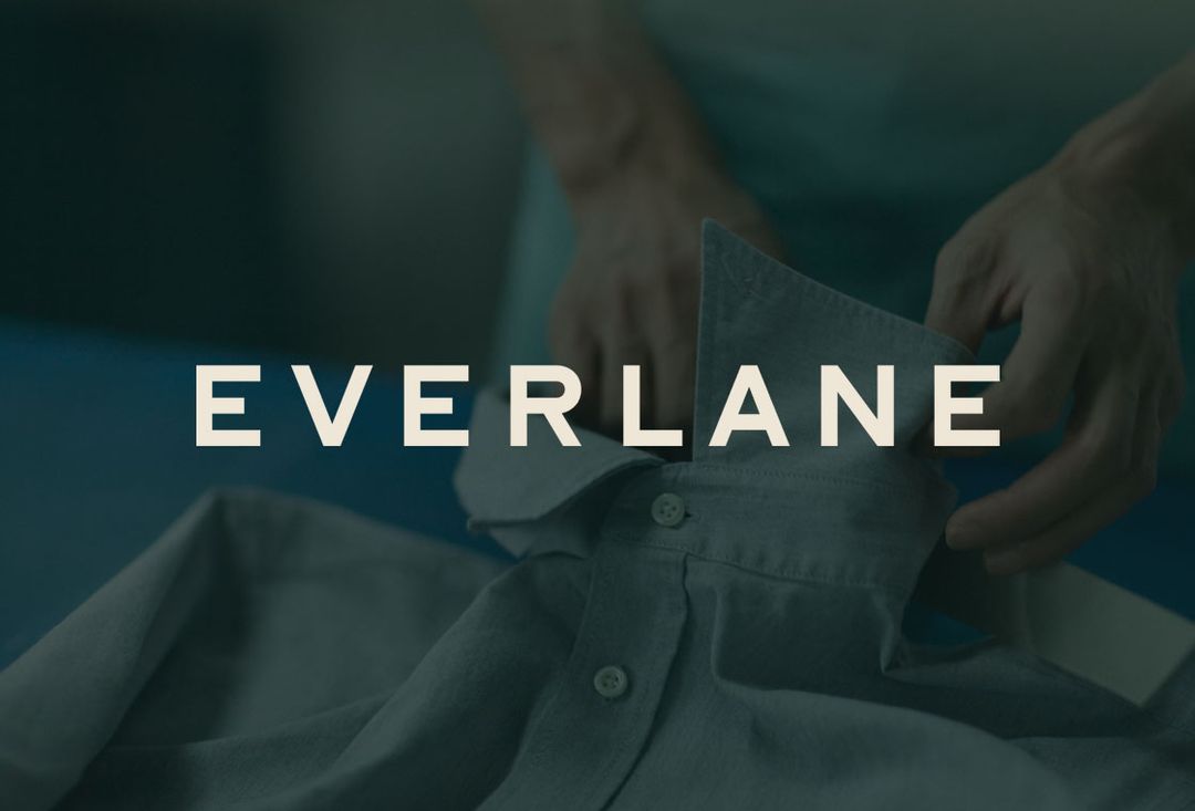
When Everlane launched, they didn’t rely on loud graphics or a flashy emblem. Instead, they built their identity around a simple wordmark with clean, modern typography. On its own, the logo wasn’t groundbreaking — but paired with Everlane’s transparent pricing model and minimalist clothing style, it became a quiet promise of honesty and quality.
Because the logo was understated, it adapted seamlessly across different mediums: sewn-in tags, eco-friendly packaging, and digital ads. Customers began to associate the clean lettering with the brand’s no-nonsense approach, making the logo a trusted visual cue. Today, that same simple “Everlane” wordmark holds just as much brand equity as logos from far older fashion houses — proof that a thoughtful, consistent identity can make a new brand feel established.
Lessons from These Logos
The success of Everlane’s minimal wordmark and Wildwood Threads’ hand-drawn pine tree shows that a logo doesn’t need to be complicated to be powerful. What matters most is clarity, authenticity, and consistency. Here are the key takeaways you can apply to your own design process:
- Design with Intention, Not Just Aesthetics
A good-looking logo isn’t enough — it must tell part of your brand’s story. Everlane’s clean typography reflected its honest, minimalist business model, while Wildwood Threads’ pine tree symbolized its deep connection to the outdoors. Every element should have a reason for being there. - Consistency Builds Recognition
Both brands committed to their designs early and used them consistently across all platforms and products. Over time, repetition made their logos instantly recognizable — even without the brand name. If you keep changing your logo, you dilute the recognition you’ve built. - Adaptability is Key
Your logo should work in multiple formats: tags, packaging, websites, social media, and even embroidered on clothing. Both Everlane and Wildwood Threads designed logos that scaled well, remained legible, and adapted to different materials and color schemes. - Authenticity Resonates with the Right Audience
Wildwood Threads didn’t try to mimic high-fashion luxury brands. They leaned into their identity as a nature-inspired, small-batch apparel maker — and it resonated with their customers. Your logo should reflect your reality, not just what’s trending. - Simplicity Wins Longevity
Trends change quickly in fashion, but simple, timeless logos tend to last. Both examples avoided overly ornate designs, ensuring they wouldn’t feel outdated in a few years.
Core Design Principles for Clothing Logos
Fashion gives you plenty of room to be bold and creative, but the best logos still follow a few timeless rules. These principles ensure that your design not only looks good today but continues to represent your brand effectively for years to come.
- Simplicity
Avoid cramming in too many details or visual effects. Simple logos are easier to recognize, reproduce, and remember. Think of Nike’s swoosh or Chanel’s interlocking C’s — they’re clean, instantly identifiable, and work across every medium. - Versatility
Your logo will appear in a variety of places — from a high-resolution website banner to a tiny clothing tag. A strong design works just as well embroidered on a cap as it does on a shopping bag or social media profile picture. - Scalability
Whether it’s printed at one inch on a care label or stretched to fill a store window, your logo should remain clear and sharp. Vector-based designs ensure that lines and shapes stay crisp at any size. - Memorability
A memorable logo uses distinctive shapes, clever typography, or a striking color palette to stick in the customer’s mind. You want someone to recognize your brand in seconds — even from across the street or with just a quick glance at a social media feed. - Timelessness
Fashion trends come and go, but a great logo transcends them. Avoid over-reliance on design fads that may look dated in a few years. Aim for a design that feels fresh today but will still make sense — and look good — a decade from now.

Defining Your Brand Identity Before Designing
A successful clothing logo starts long before you open design software or pick out fonts. It begins with brand self-awareness — getting crystal clear on who you are, what you stand for, and how you want your audience to feel when they see your name. Without this foundation, even the most visually appealing logo can miss the mark.
Think of your logo as a visual handshake. It’s not just about looking stylish — it’s about introducing yourself in a way that feels authentic and memorable. If you don’t know who you are as a brand, your logo can’t communicate it to anyone else.
Here are the questions worth sitting with before you sketch your first line:
- What kind of clothing do you sell? Are you making everyday casual wear, red-carpet-ready formal attire, high-performance athletic gear, or bold, avant-garde pieces? Each category carries its own design cues and customer expectations.
- What’s your brand personality? Is your tone bold and unapologetic, elegantly refined, playfully lighthearted, or rebelliously unconventional? Your personality will guide not just the look of your logo but also its energy.
- What values drive your brand? Do you stand for sustainability, making affordability accessible, exuding exclusivity, or celebrating craftsmanship? Your values should influence your design decisions as much as your personal taste does.
These answers influence every choice you make — from typography to color palette to the shapes you incorporate.
For example:
- A streetwear brand might gravitate toward bold, graffiti-inspired typography, high-contrast colors, and edgy iconography.
- A luxury label might favor sleek serif fonts, muted color schemes, and minimal iconography that whispers sophistication rather than shouting for attention.
- An eco-friendly clothing line could lean toward earthy tones, organic shapes, and hand-drawn elements that reinforce a natural, grounded identity.
The more specific you get about your brand identity, the easier it will be to make design choices that feel intentional. It also helps you avoid the trap of chasing trends that don’t fit who you are.
Pro Tip: Write down three words that define your brand identity. These words should reflect how you want your customers to describe you — not just what you think looks cool. Keep them visible during your design process. Every time you make a decision about your logo, ask yourself: “Do these choices reflect my three words?” If the answer is no, it’s time to adjust.
Tips for Choosing the Best Clothing Logo Designs for Business
Make Use of Color
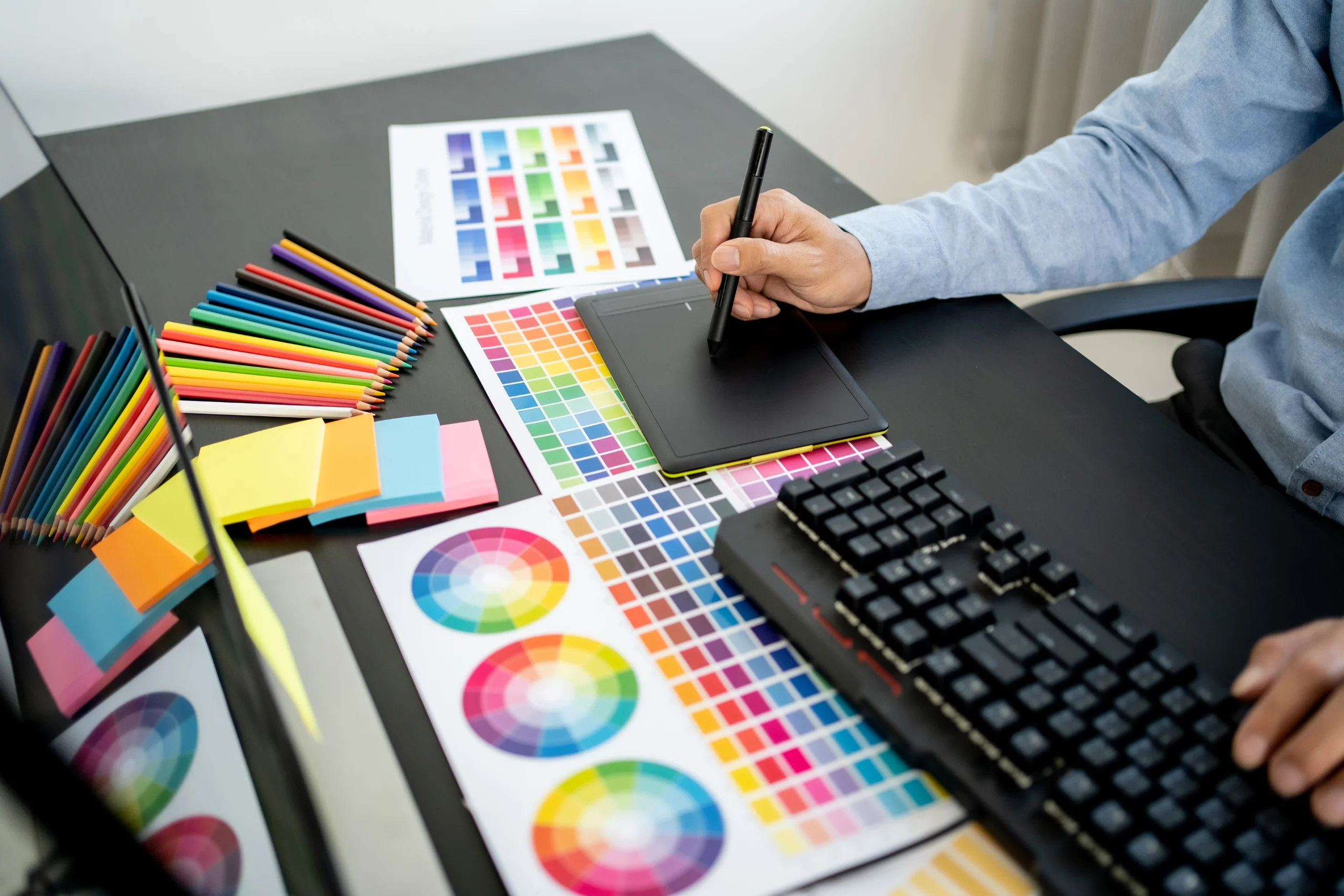
Color is one of your most powerful tools. Consider how you want a consumer to respond when they see the logo and which colors will help you achieve that. Because there is a strong emotional link between color and emotion, you want to be sure that the colors you use make the consumer feel the way you would like them to.
Different colors evoke different emotions:
- Black – Luxury, elegance, power (Chanel, Prada).
- White – Minimalism, purity, freshness (Calvin Klein).
- Red – Passion, energy, boldness (Supreme).
- Blue – Trust, calm, stability (often used in sports brands).
- Green – Sustainability, nature, health (Patagonia).
Tip: Limit your palette to 2–3 colors for easier reproduction and brand consistency.
Get to Know the Brand
Apparel logo design is not a one-size-fits-all endeavor. The fashion business is enormous, and the personalities of one brand might be significantly different from those of another.
Spend some time on the company’s website or chat with stakeholders to get to know its personality, and then allow that personality to lead your creative approach.
If you’re dealing with a customer who caters to a higher-end, fashionable market, keep your design straightforward and attractive. If, on the other hand, your customer is more whimsical, you may make your design a bit more flamboyant to represent that.
Understand Target Customer
It’s not enough to grasp the brand personality you’re working with; you also need to comprehend the client they’re trying to reach. Designing for your clothing brand is one thing; designing for your customer’s tastes is another. Your logo should resonate with the people you want to attract.
Consider:
- Age group: Gen Z might appreciate bold, modern aesthetics, while an older demographic may prefer timeless elegance.
- Lifestyle: Activewear customers want logos that feel dynamic. High-end couture clients may want sophistication.
- Cultural influences: Streetwear logos often borrow from music, art, and skate culture, while resort-wear brands may draw on coastal or tropical themes.
Example: A children’s apparel store targeting parents of toddlers will likely choose bright, playful designs — very different from a logo for a high-fashion women’s boutique.
Typography Choices for Clothing Brands
Typography shapes a logo’s personality just as much as color does. Serif fonts convey tradition and sophistication, as seen with Dior and Burberry, making them ideal for luxury brands. Sans-serif fonts offer a modern, clean look — think Uniqlo or Zara — and often work well for contemporary or minimalist labels. Script fonts bring elegance and artistry, often used in signature-style logos for boutique or couture fashion. Custom lettering ensures your logo is one-of-a-kind and instantly recognizable. Whatever style you choose, ensure it remains clear and legible at small sizes, especially on clothing tags, care labels, or embroidery.
Simple & Shareable
A logo should be distinctive, and there are two key components that contribute to this. First and foremost, the layout should be clear enough that everyone can comprehend it right away. This is not the place to perplex or perplex clients. You want them to be able to look at, comprehend, and interact with something straight immediately.
Second, the style should be easily shared. Consider how crucial photographs are in social media. The logo you create should help their social media presence in a good way that is consistent with the rest of their messaging.
Incorporating Symbols and Icons
When designing your clothing brand’s logo, one of the first decisions you’ll make is whether to use typography alone or combine it with a symbol or icon. In fashion, both approaches can work beautifully — the right choice depends on your brand identity and how you want to connect with your audience.
- Abstract Marks
Abstract symbols — think swooshes, curves, or custom shapes — can give your logo a versatile, non-literal quality. They often become recognizable over time, much like Nike’s swoosh or Adidas’s three stripes, and can be used independently of the brand name once recognition builds. - Nature-Inspired Symbols
If your brand emphasizes sustainability or draws inspiration from the outdoors, elements like leaves, mountains, waves, or trees can subtly reinforce that connection. For example, a small leaf icon paired with a clean wordmark can instantly signal eco-friendly values without being heavy-handed. - Geometric Shapes
Squares, circles, triangles, and other geometric forms convey structure, precision, and modernity. They can be particularly effective for streetwear or minimalist brands, where clean lines and balanced forms suggest confidence and intentionality. - Avoid Overly Complex Illustrations
While intricate artwork might look stunning in a large print, it can become problematic when scaled down for embroidery, tags, or small web graphics. Fine details can get lost, and printing costs may increase. Aim for symbols that remain recognizable even at very small sizes.
Pro Tip: Before finalizing any icon, test it in black and white, and at the smallest size you anticipate using. If it loses clarity or impact, simplify it.
Balancing Creativity with Timelessness
The fashion industry thrives on change. Trends shift season by season, colors and patterns come and go, and what’s “in” today may feel outdated in a year. But your logo isn’t a seasonal collection — it’s the foundation of your brand identity.
To create a logo that lasts, you need to strike the right balance between creativity and timelessness:
- Infuse Personality Without Overcomplicating
Unique elements like a custom letterform or a subtle graphic twist can give your logo personality, but avoid piling on too many trendy effects or colors. A design overloaded with current fashion tropes might look dated when styles inevitably change. - Think Long-Term Appeal
Ask yourself: “Will this still look relevant five or ten years from now?” Many iconic fashion logos — from Levi’s to Gucci — have stood the test of time because they rely on strong, simple design rather than seasonal fads. - Update, Don’t Overhaul
If your brand evolves, small updates to your logo can refresh its look without sacrificing recognition. This could mean refining line weights, adjusting letter spacing, or modernizing colors — not reinventing the entire design. - Design for Multiple Contexts
A timeless logo works across decades because it adapts easily to new mediums — from print to web to whatever comes next. Keep adaptability in mind during the creative process.
Bottom Line: Creativity is essential for making your logo stand out, but restraint is what ensures it stays relevant. Think of your logo as a classic piece in your brand’s wardrobe — one that pairs well with any trend, in any era.
Research & Brainstorm Your Business Model
So study and ideation are the first and most critical steps in creating the right logo. There is no way in hell you can create the ideal logo on the fly, and there is no way you can create your logo before even considering an idea. In some ways, creating your logo is similar to creating your brand name; you must look at it through the eyes of your audience and attempt to grasp what they see from gazing at your company.
When it comes to logo design, the golden guideline is to make it basic but appealing; less is typically more. Consider the world’s greatest and most recognizable logos. FedEx, Nike, and Apple are three brands that spring to mind.
Conceptualize Logo Idea
You must now make a few decisions. Do you require a graphical logo? Do you want a typeface with one-of-a-kind or bespoke typography? Would you like to do a mix of the two? So now comes the difficult (or perhaps enjoyable) phase. Make a list of all that comes to mind. SKETCH!
When I initially imagined my Lowdtown logo, I wanted to employ bespoke typography.
Use the Right Tools
I won’t dive into the gritty technical details of developing the logo, but I strongly recommend utilizing Adobe Illustrator. As a result, you may adapt your logo to any height without fear of losing quality. If you wish to trace a graphical emblem that you designed, utilize the pen tool rather than the customized brush tool or whatever. You’ll obtain the finest lines and edges, which is essential for a logo unless you want a sloppy or untidy look. Also, be as accurate as possible; if you’re drawing a straight line, double-check that it’s straight. Little flaws like that will bite you in the arse.
Testing Your Custom Logo
Once you’ve nailed down the appearance of your logo, don’t be hesitant to solicit feedback, unless it’s highly classified or some such, in which case you’re definitely a professional and shouldn’t be reading this. This is an extremely important phase because you want to know if your typeface is legible if it is typographical, or if people can determine what your logo is if it is graphical (think Apple, easily identifiable as the fruit). For Lowdtown, I asked on a forum what folks assumed of my logo.
Before you commit to a final design, it’s worth taking the time to see how your logo performs in the real world. A logo that looks great on your computer screen might not translate well onto fabric, packaging, or digital platforms. Testing helps you catch problems early and ensures your design works everywhere it needs to appear.
- Gather Honest Feedback
Share your logo with people who fit your target customer profile — not just friends and family who might be biased. Ask open-ended questions like, “What does this logo make you think of?” or “If you saw this on a tag, what kind of clothing would you expect?” The answers will reveal whether your design is communicating the right message. - Test in Black and White
Even if your logo is colorful, make sure it works in black and white. This is crucial for certain applications, like embroidery, receipts, or one-color printing. If the design loses impact without color, it may need simplification. - Mock It Up in Context
Place your logo on realistic mockups: T-shirts, tags, shopping bags, business cards, social media banners, and your website. Seeing it in context helps you spot sizing issues, color clashes, or readability problems you might miss on a blank canvas. - Check for Scalability
Print your logo at different sizes — from a one-inch clothing label to a large poster — to ensure it stays crisp and legible. Overly fine details can disappear at small sizes, while imbalanced proportions might look awkward when enlarged. - Observe Emotional Reaction
Pay attention to the subtle cues. Do people smile, lean in, or show curiosity? Or do they seem indifferent? A strong logo should spark some kind of emotional connection, even if it’s subtle.
By thoroughly testing your logo, you’re making sure it not only looks good in theory but also performs effectively in the real world — on the clothing, packaging, and digital spaces where your brand will live.
DIY Tools vs. Hiring a Designer
When it comes to creating a logo for your clothing brand, you essentially have three main routes: do it yourself using online tools, hire a professional designer, or combine the two approaches. Each option comes with its own pros, cons, costs, and considerations — and your choice will depend on your budget, time constraints, and creative confidence.
DIY Tools
Platforms like Canva, Looka, Placeit, and Adobe Express have opened the doors for anyone to create a decent-looking logo without needing a design degree. These tools come with drag-and-drop functionality, pre-made templates, and easy export options. For clothing brands, they even offer mockup features so you can see how your logo would look on a T-shirt, clothing tag, or tote bag.
Pros:
- Affordable — many are free or low-cost subscriptions.
- Fast — you can create a usable logo in a matter of hours.
- User-friendly — no complex software skills required.
- Built-in mockup previews for apparel applications.
Cons:
- Limited originality — templates are used by many other brands, which can make your logo look generic.
- Design constraints — you may be unable to fully customize typography, shapes, or spacing.
- Potential legal issues — some platforms’ stock icons may have licensing restrictions.
Best for: Entrepreneurs on a tight budget who need something simple and functional quickly, or those who want to experiment with ideas before committing to a final version.
Hiring a Designer
A professional designer or branding agency can bring an entirely different level of polish and uniqueness to your clothing brand logo. Professionals don’t just design — they research your target audience, study your competitors, and ensure your logo works across all mediums, from embroidery to e-commerce banners.
Pros:
- Completely custom and unique to your brand.
- Higher attention to detail, scalability, and brand alignment.
- Strategic input on brand identity, color psychology, and typography.
- Professional file preparation for every format you’ll need.
Cons:
- Cost — prices can range from $300 to several thousand dollars, depending on the designer’s experience and the complexity of the project.
- Timeline — custom design can take weeks or months, especially if revisions are involved.
- Requires clear communication — you’ll need to articulate your brand vision effectively.
Best for: Clothing brands that want to establish a strong, distinctive identity from the start, have the budget for a professional, and understand the long-term value of a unique brand mark.
Hybrid Approach
A hybrid approach blends the best of both worlds. You can start by creating a rough concept yourself using DIY tools, mood boards, or even pencil sketches. Once you have something you like, hand it off to a professional designer to refine and finalize it. This approach gives you creative control over the initial vision while ensuring the final product has professional polish.
Why this works well for clothing brands:
- You can capture your personal style and creative ideas early on.
- A designer can make the technical adjustments needed for print, embroidery, and web use.
- It can reduce overall costs since you’re saving the designer time in conceptual development.
- You get a collaborative process — your vision plus professional execution.
Example: You might sketch a stylized monogram for your streetwear line, then hire a designer to adjust the proportions, refine the typography, and prepare it in all the right file formats for your tags, online shop, and marketing materials.
DIY vs. Hiring a Designer vs. Hybrid Approach
Approach | Cost | Time to Complete | Quality & Originality | Best For |
|---|---|---|---|---|
| DIY Tools (Canva, Looka, Placeit) | Free to ~$30/month | Hours to 1–2 days | Moderate — limited by templates, may look generic | New brands on tight budgets, quick prototypes, experimenting with ideas |
| Hiring a Designer | $300 – $5,000+ | 2–6 weeks (depending on revisions) | High — fully custom, professional polish, strategic design | Established brands, premium positioning, long-term identity investment |
| Hybrid Approach | $100 – $1,500 | 1–3 weeks | High — your concept refined by a professional | Brands wanting creative control + professional execution without full agency cost |
FAQ
How important is a logo for a clothing brand?
A logo is crucial because it acts as your brand’s visual identity. It’s the symbol customers recognize, remember, and associate with your products. In fashion, where visual appeal drives purchasing decisions, a strong logo helps you stand out in a crowded market, reinforces your brand personality, and builds trust over time. A well-designed logo also adds perceived value — customers often associate a premium-looking logo with premium quality. Without a strong logo, even great clothing can struggle to gain traction.
Can I design my own clothing logo without a design background?
Yes, you can. Many entrepreneurs successfully create their own logos using DIY tools like Canva, Looka, or Adobe Express. The key is to keep the design simple, choose a limited color palette, and test it for legibility at different sizes. However, if you want a truly unique and professional finish, you may want to hire a designer to refine your concept. This hybrid approach allows you to inject your creative vision while ensuring technical perfection.
How do I choose colors for my clothing brand logo?
Start with color psychology — think about the emotions you want your brand to evoke. Black can communicate luxury, green can convey eco-consciousness, and bold red can signal energy and confidence. Consider your target audience’s preferences and cultural associations. Limit your color palette to two or three shades for consistency and easier reproduction, especially for embroidery or screen printing on clothing.
What file formats do I need for my clothing logo?
You’ll need vector files (.AI, .EPS, or .SVG) for scalability without losing quality. You should also have high-resolution PNG files with transparent backgrounds for digital use, as well as embroidery-ready files if you plan to stitch the logo onto garments. These formats ensure your logo looks sharp whether it’s on a website, clothing tag, or large banner.
How often should I update my clothing brand logo?
Ideally, your logo should be timeless enough to last for many years. However, small updates — known as “refreshes” — can keep it modern without losing brand recognition. Major redesigns should be rare and only occur if your brand has undergone significant changes in direction, audience, or style. Frequent overhauls can confuse customers and weaken brand identity.
This article was originally published on May 18, 2022 and updated on August 10, 2025.
