

How frequently do you use mobile phones for web browsing? I guess maximum times, and it’s common in every eight out of ten people. What do you think? What does it mean? It means mobile-friendly designs play a vital role in the internet world. No matter which niche you belong to, it should be responsive to all the devices if you have a website.
If we look at the stats, 50% of users demand mobile-friendly websites, whereas 61% of users switch to the competitor sites if they don’t find their desired information.

And if you have checked the latest mobile survey, you will find that the forecasted number of mobile users will reach 6.95 billion.

Thus, there is a booming future ahead with your mobile-friendly website, and in this buzzing mobile trend, you need to follow the right practices and trends. For that, I have mentioned the top mobile-friendly web design trends of 2020. So, let’s begin.
1- Mobile-friendly web designs that encourage learner desktop experiences
By incorporating the mobile designs on your website, you become more efficient and accessible. What you need to follow here is, provide the same engaging experience on the mobile phone as you offer on your desktop. Here, you have to work on the site’s UI and UX part.
Let’s take an example:
It’s a PixelCrayons website on the mobile phone. Here the navigation is simple, and menus are easily visible.
Now see its desktop image where it is in the normal and a bit elaborative form. Additionally, users are encountering the same experience.
You will hardly notice a difference in terms of user experience and navigation. So, implement the same UI & UX tactics that you do for the desktop design.
2- Mobile-friendly designs that eliminate the excess
Mobile devices are famous and infamous both for providing extra features. These are the options and choices of working virtually with every new release.
In the past, web designers followed something like where it becomes tough to put all the information on the smaller screen of a mobile. Whereas it distracts the users from their goal and many times spoil their experience.
However, now, our designers have some excellent techniques that meet user demands. It’s all like converting a landscape image to a portrait image and shows where non-critical content gets deleted, and shifts key information to the center, or at the right section.
In such a way, it becomes easier to present the right and exact thing in the small space and help users make better choices.
Let’s understand this with the examples of top websites:


Have you noticed the difference? See how the designers have adjusted the design and showcased the right information. You will notice they have shifted the menus to keep the users engaged and focused.
Now see another example.


Here, you can see they have changed the size of the image and presented only the required things to attract the users.
3- Mobile-friendly websites that leverage space-
Despite reducing a content amount, a web designer can opt for leveraging the area. They can use different ratios for this trick.
Let’s see the examples:


In both the mobile and desktop view, you can see that designer has leveraged the space well and used the larger fonts that look attractive and make sense.
4- Mobile-friendly websites that spotlight visual content
Another factor that can help make your sites attractive visual content. You can highlight your services in the form of the right choice of images representing your services and target potential customers.
Let get it clear with the example:


What have you noticed there? Image right where you can see it act as a core point and represent the site’s intent, i.e., the service they are providing. Thus, focus on the visual contents too for making your website responsive.
5. Mobile-friendly websites with enhanced readability- Another thing that comes on the way of making your site responsive is improved readability.
Let’s see the example:
Mobile View
Desktop View
In both the mobile and desktop view, you will notice that designers have put the main focus on the content, and it is representing the services well. Instead of cramming all the images at once, you better remove the extra ones for a better view of the mobile phone’s small screen. Additionally, it highlights readability, and the site’s intent is clearly understood with the content.
6. Mobile-friendly websites that can increase leads-Many of you know that almost 50-60% of web traffic comes from mobile, and it’s the same for leads. But for this, you need to follow a trick in making your site responsive from the lead’s perspective.
Here, we have different examples. Let’s see:
Example 1

Mobile View

Desktop View
Example 2

Mobile View

Desktop View
You can see a live chat option in both examples. The only difference is that on mobile, you will be directed to a new page. And a live chat option is always a leads generating factor.
Now see a different example:
Example 3

Mobile View

Desktop View
Example 2
Mobile View

Desktop View
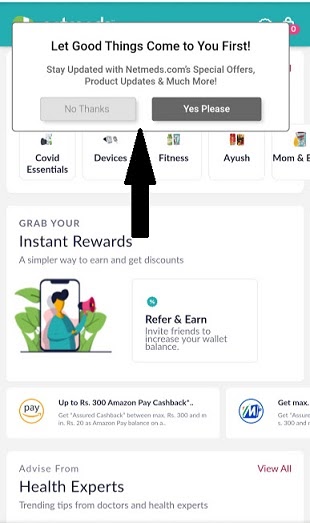
In the above two examples, you will notice how the designers have managed the website responsiveness on both the screens. These pop-ups also act as a sales booster if correctly done, as shown in the above two examples.
Wrapping Up!
Now you know the top mobile designing trends for your websites. You can implement these on your sites or get it done by the top web development companies in India.
But before this, take a quick look from the below checklist of the responsive web designing trends.
- Encourage Learner Desktop Experiences
- Eliminating Excess Content
- Use Available Space
- Improve Readability
- Putting a Spotlight on Visual Content
- Generate More Leads
All these mobile-friendly web designing trends are amazing and can help you achieve your desired business goals. So, now don’t throw away your mobile customers and dwindle your search traffic. Make sure your websites are mobile-friendly design and ready to compete in the market.
Good Luck, guys!